See also, Pairwise Deletion of Missing Data vs. Mean Substitution and Casewise vs. pairwise deletion of missing data
Parametric Curve. Parametric equations can be used to represent curves whose graphs are not simple functions of the type y = f(x), where y and x are represented along the vertical and horizontal axes, respectively. Instead, the curves in the x-y plane are defined parametrically as two simultaneous functions of a parameter t that ranges over some interval (minimum, maximum). You can specify an equation y = f(t) for the y-component of the curve, and an equation x = g(t) for the x-component of the curve, for a specified range of parameter t.
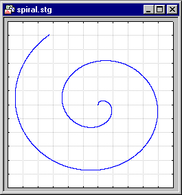
For example, to plot a spiral, you could specify:
y(t) = t*cos(t)
x(t) = t*sin(t)
For 0 < = t < = 12.
There are a wide variety of curves, from simple circles to complex shapes that can be produced via the parametric curves facilities. Here is another example:
y(t) = (a + b)*sin(t) - b*sin((a/b + 1)*t)
x(t) = (a + b)*cos(t) - b*cos((a/b + 1)* t)
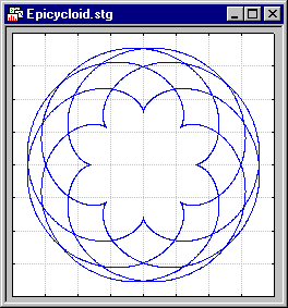
In the plot shown above, a and b were set to 8 and 5, respectively, and parameter t was plotted over the range from 0 to 100. If you change a and b in the parametric equations shown above, very different shapes will emerge.
Pareto Distribution. The standard Pareto distribution has density function (for positive parameter c ):
f(x) = c/xc+1 1  x, c > 0
where
c is the shape parameter of the distribution.
![[Animated Pareto Distribution]](graphics/an_pare.gif)
The animation above shows the Pareto distribution for the shape parameter equal to 1, 2, 3, 4, and 5.
Partial Correlation. A correlation between two variables that remains after controlling for (e.g., partialling out) one or more other variables. For example, the HAIR LENGTH may correlate with HEIGHT (with taller individuals having shorter hair), however, that correlation will likely become smaller or even disappear if the influence of GENDER is removed, since women are generally shorter and are more likely to have long hair than men.
See also Correlation, Spurious Correlations, Basic Statistics, Multiple Regression, Structural Equation Modeling (SEPATH).
Partial Least Squares Regression (PLS). Partial Least Squares is a linear regression method that forms components (factors, or latent variables) as new independent variables (explanatory variables, or predictors) in a regression model. The components in partial least squares are determined by both the response variable(s) and the predictor variables. A regression model from partial least squares can be expected to have a smaller number of components without an appreciably smaller R-square value.
For an overview of partial least squares see the Partial Least Squares Model chapter.
Partial Residuals. In a (linear, nonlinear, or additive) regression model with m predictors, the partial residuals for a predictor k are computed by removing from the dependent variable values the effects of all predictors i = 1, ... , m; i�k. Scatterplots of partial residuals against predictor variables are particularly useful in generalized additive models, where they may aid in the interpretation of the (non-linear) unique effect of the predictors in the overall model.
Parzen Window. In Time Series, the Parzen window is a weighted moving average transformation used to smooth the periodogram values. In the Parzen window (Parzen, 1961), for each frequency, the weights for the weighted moving average of the periodogram values are computed as:
wj = 1-6*(j/p)2 + 6*(j/p)3 (for j = 0 to p/2)
wj = 2*(1-j/p)3 (for j = p/2 + 1 to p)
w-j = wj (for j  0)
0)
where p = (m-1)/2
This weight function will assign the greatest weight to the observation being smoothed in the center of the window, and increasingly smaller weights to values that are further away from the center.
See also, Basic Notations and Principles.
In Neural Networks, the Parzen window is an alternative name for kernel-based approximation techniques, as used in probabilistic neural networks and generalized regression neural networks (Parzen, 1962).
Pearson Correlation. The most widely-used type of correlation coefficient is Pearson r (Pearson, 1896), also called linear or product-moment correlation (the term correlation was first used by Galton, 1888). Using non technical language, one can say that the correlation coefficient determines the extent to which values of two variables are "proportional" to each other. The value of the correlation (i.e., correlation coefficient) does not depend on the specific measurement units used; for example, the correlation between height and weight will be identical regardless of whether inches and pounds, or centimeters and kilograms are used as measurement units. Proportional means linearly related; that is, the correlation is high if it can be approximated by a straight line (sloped upwards or downwards). This line is called the regression line or least squares line, because it is determined such that the sum of the squared distances of all the data points from the line is the lowest possible. Pearson correlation assumes that the two variables are measured on at least interval scales. The Pearson product moment correlation coefficient is calculated as follows:
r12 = [ (Yi1 - Y-bar1)*(Yi2 - Y-bar2)] / [(Yi1 - Y-bar1)2 * (Yi2 - Y-bar2)2]1/2
See also, Correlations - Overview.
Pearson Curves. A system of distributions proposed by Karl Pearson (e.g., see Hahn and Shapiro, 1967, pages 220-224) consists of seven solutions (of 12 originally enumerated by Pearson) to a differential equation which approximate a wide range of distributions of different shapes. Gruska, Mirkhani, and Lamberson (1989) describe in detail how the different Pearson curves can be fit to an empirical distribution. A method for computing specific Pearson percentiles is also described in Davis and Stephens (1983).See also, Johnson Curves.
Pearson Residuals. After fitting a generalized linear model to the data, to check the adequacy of the respective model, one usually computes various residual statistics. The Pearson residual is computed as the raw residual (y-m), scaled by the estimated standard deviation of y.For a detailed discussion of residual statistics for generalized linear models, see McCullagh and Nelder (1989); see also the description of the Generalized Linear Models chapter.
Penalty Functions. A constraint specified in a loss function which applies a penalty (a very large value) to the loss function when certain undesirable conditions are met. Using a penalty function allows the user to control what permissible values of the parameters to be estimated may be manipulated by the Non-linear estimation program. For more information, see Penalty Functions, Constraining Parameters.
Percentiles. The percentile (this term was first used by Galton, 1885a) of a distribution of values is a number xp such that a percentage p of the population values are less than or equal to xp. For example, the 25th percentile (also referred to as the .25 quantile or lower quartile) of a variable is a value (xp) such that 25% (p) of the values of the variable fall below that value.
Similarly, the 75th percentile (also referred to as the .75 quantile or upper quartile) is a value such that 75% of the values of the variable fall below that value and is calculated accordingly.
Perceptrons (in Neural Networks). Perceptrons are a simple form of neural networks. They have no hidden layers, and can only perform linear classification tasks. Perceptrons were devised by Rosenblatt (1958), and their limitations were criticized by Minsky and Papert (1969), leading to a loss of interest in the field. Fausett (1994) gives a good history of these early developments.
A perceptron is modeled by creating a two-layer MLP network, and changing the activation function of the output layer to Step.
The perceptron learning algorithm is modeled by using back propagation with Momentum 0.0 and Shuffle turned Off.
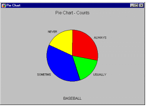
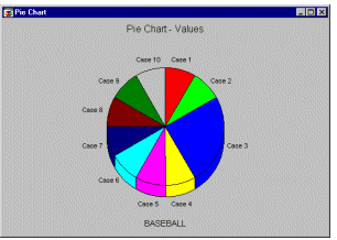
Pie Chart. Pie charts (the term first used by Haskell, 1922) are useful for representing proportions. Individual data values of the X variable are represented as the "wedges" of the pie.Pie Chart - Counts. Unlike the values pie chart, this type of pie (this term was first used by Haskell, 1922) chart (sometimes called frequency pie chart) interprets data like a histogram. It categorizes all values of the selected variable following the selected categorization technique and then displays the relative frequencies as pie slices of proportional sizes.
See also, Pie Charts.
Pie Chart - Multi-pattern Bar. The multi-pattern bar plot is designed to display the same type of data as the values pie chart (see Pie Chart - Values or 2D Histograms), however, the consecutive values are represented by the height of vertical bars (of different colors and patterns) and not areas of pie slices.
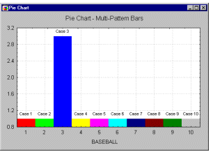
Their advantage over pie charts is that they may allow for more precise comparisons between presented values (e.g., small pie slices may be difficult to compare if they are not adjacent). This type of graph may also have advantages over regular histograms (where one fill pattern and color is used for all columns), in cases when quick identification of specific columns is desired.
See also, Pie Charts.
Pie Chart - Values. The sequence of values from the selected variable will be represented by consecutive slices of the pie (this term was first used by Haskell, 1922); the size of each slice will be proportional to the respective value. The values should be greater than 0 (0's and negative values cannot be represented as slices of the pie). This simple type of pie chart (sometimes called data pie chart) interprets data in the most straightforward manner: one case = one slice.
See also, Pie Charts.
PNG (Portable Network Graphics). PNG (Portable Network Graphics) is a graphics file format designed to store bitmap (i.e., raster, as opposed to vector/metafile) graphic images. It was introduced to be a replacement for the patented GIF format (mostly to avoid the legal restrictions associated with the patent). A PNG image may contain a variable number of colors, including a transparent color. The size of the file depends on the number of colors used in the specific image. A compression method is used (to reduce the file size) which is highly effective if a large proportion of the image is built of the pixels with the same color attributes (e.g., it is highly effective for charts and schematic line art, but somewhat less effective than the JPEG format for photographs).
Poisson Distribution. The Poisson distribution (the term first used by Soper, 1914) is defined as:
f(x) = ( x * e-)/x!
for x = 0, 1, 2, .., 0 <
where
(lambda) is the expected value of x (the mean)
e is the
base of the natural logarithm, sometimes called Euler's e (2.71...)
Polar Coordinates.
Polar coordinates (r, ) represent the location of a point (in 2D space) by its distance (r) from a fixed point on a fixed line (polar axis) and the angle (, in radians) from that fixed line.
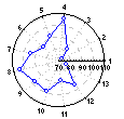
Polar plots are used to visualize functions. They also offer an intuitive way to present relations involving a variable representing direction.
See also, Cartesian Coordinates.
Polynomial. This fits to the data, a polynomial function of the form:
y = b0 + b1x + b2x2 + b3x3 + ... + bnxn
where n is the order of the polynomial.
Fitting centered polynomial models via Multiple Regression. The fitting of higher-order polynomials of an independent variable with a mean not equal to zero can create difficult numerical problems. Specifically, the polynomials will be highly correlated due to the mean of the primary independent variable. With large numbers (e.g., Julian dates), this problem is very serious, and if proper protections are not put in place, can cause wrong results! The solution is to "center" the independent variable (sometimes, this procedures is referred to as "centered polynomials"), i.e., to subtract the mean, and then to compute the polynomials. See, for example, the classic text by Neter, Wasserman, & Kutner (1985, Chapter 9), for a detailed discussion of this issue (and analyses with polynomial models in general).
Positive Correlation. The relationship between two variables is such that as one variable's values tend to increase, the other variable's values also tend to increase. This is represented by a positive correlation coefficient.
See also, Correlations - Introductory Overview.
Post hoc Comparisons. Usually, after obtaining a statistically significant F test from the ANOVA, one wants to know which means contributed to the effect; that is, which groups are particularly different from each other. One could of course perform a series of simple t-tests to compare all possible pairs of means. However, such a procedure would capitalize on chance. The reported probability levels would actually overestimate the statistical significance of mean differences. For example, suppose you took 20 samples of 10 random numbers each, and computed 20 means. Then, take the group (sample) with the highest mean and compare it with that of the lowest mean. The t-test for independent samples will test whether or not those two means are significantly different from each other, provided that they were the only two samples taken. Post-hoc comparison techniques on the other hand, specifically take into account the fact that more than two samples were taken. They are used as either hypothesis testing or exploratory methods.
For more information, see the ANOVA chapter.
Power Goal. The minimum power to be achieved when searching for an acceptable sample size. An acceptable sample size must yield a power greater than or equal to this value.
For more information see the chapter on Power Analysis.
Ppk, Pp, Pr. See Process Performance Indices, Cpk, Cp, Cr. See also, Process Capability Analysis.
Post Synaptic Potential (PSP) function. The function applied by a unit to its inputs, weights and thresholds to form the unit's input (or activation) level. The two major PSP functions are linear (weighted sum minus threshold) and radial (scaled squared distance of weight vector from input vector).
See also, Neural Networks.
Prediction Interval Ellipse. Often plotted on 2D Scatterplots, this interval describes the area in which a single new observation can be expected to fall with a certain probability (alpha), given that the new observation comes from a bivariate normal distribution with the parameters (means, standard deviations, covariance) as estimated from the observed points shown in the plot.
The coordinates for the ellipse are computed so that:
((n-p)*n)/(p*(n-1)*(n+1))*(X-Xm) 'S-1 (X-Xm)~ F(alpha,p,n-p)
where:
n number of cases
p number of variables; i.e., p=2 in the case of the bivariate scatterplot
X vector of coordinates (pair of coordinates, since p=2)
Xm vector of means for the p dimensions (variables) in the plot
S-1 inverse of the variance covariance matrix for the p variables
F(alpha,p, n-p) the value of F, given alpha, p, and n-p.
Note that if the number of observations in the scatterplot is small, then the prediction interval may be very large. For additional information see, for example, Tracy, Young, and Mason (1992), or Montgomery 1996).
Prediction Profiles. When the results of an experiment are analyzed, the observed responses on the dependent variables can be fit to a separate prediction equation for each dependent variable (containing different coefficients but the same terms). Once these equations are constructed, predicted values for the dependent variables can be computed at any combination of levels of the predictor variables. A prediction profile for a dependent variable consists of a series of graphs, one for each independent variable, of the predicted values for the dependent variable at different levels of one independent variable, holding the levels of the other independent variables constant at specified values. Inspecting the prediction profiles for the dependent variables can show which levels of the predictor variables produce the most desirable predicted responses on the dependent variables.
For a detailed description of prediction profiles and desirability profiles see Profiling Predicted Responses and Response Desirability.
Predictive Data Mining. The term Predictive Data Mining is usually applied to identify data mining projects with the goal to identify a statistical or neural network model or set of models that can be used to predict some response of interest. For example, a credit card company may want to engage in predictive data mining, to derive a (trained) model or set of models (e.g., neural networks, meta-learner) that can quickly identify transactions which have a high probability of being fraudulent. Other types of data mining projects may be more exploratory in nature (e.g., to identify cluster or segments of customers), in which case drill-down descriptive and exploratory methods would be applied. Data reduction is another possible objective for data mining (e.g., to aggregate or amalgamate the information in very large data sets into useful and manageable chunks).
Predictive Mapping. One application of multiple correspondence analysis is to perform the equivalent of a Multiple Regression for categorical variables, by adding supplementary columns to a design matrix (see also Burt tables). For example, suppose you had a design matrix containing various categorical indicators of health related behaviors (e.g., whether or not the individual smoked, exercised, etc.). You could add two columns to indicate whether or not the respective subject had or had not been ill over the past year (i.e., you could add one column Ill and another column Not ill, and enter 0's and 1's to indicate each subject's health status). If in a simple correspondence analysis of the design matrix, you added those columns as supplementary columns to the analysis, then (1) the summary statistics for the quality of representation (see the Correspondence Analysis Overview) for those columns would give you an indication of how well you can "explain" illness as a function of the other variables in the design matrix, and (2) the display of the column points in the final coordinate system would provide an indication of the nature (e.g., direction) of the relationships between the columns in the design matrix and the column points indicating illness. This technique (adding supplementary points to a multiple correspondence analysis) is also called predictive mapping.PRESS Statistic. The PRESS statistic is often used in regression analyses, in order to summarize the fit of a particular model in a sample of observations that were not used to estimate the model parameters. It can simply be computed as the sums of squares of the prediction residuals for those observations.
See Draper and Smith (1981); the PRESS statistic is, for example, computed in the Partial Least Squares Model for the cross-validation (verification) samples.
Principal Components Analysis. A linear dimensionality reduction technique, which identifies orthogonal directions of maximum variance in the original data, and projects the data into a lower-dimensionality space formed of a sub-set of the highest-variance components (Bishop, 1995).
See also, Factor Analysis and Neural Networks.
Prior Probabilities. Proportionate distribution of classes in the population (in a classification problem), especially where known to be different than the distribution in the training data set. Used to modify probabilistic neural network training in neural networks.
See also, Neural Networks, Discriminant Function Analysis.
Probabilistic Neural Networks (PNN). A type of neural network using kernel-based approximation to form an estimate of the probability density functions of classes in a classification problem. One of the so-called Bayesian networks (Speckt, 1990; Patterson, 1996; Bishop, 1995). See also, Neural Networks.
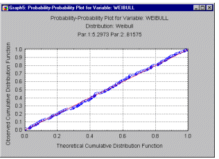
Probability-Probability Plots. You can visually check for the fit of a theoretical distribution to the observed data by examining the probability-probability plot (also called Probability Plot, see example below). In probability- probability plots (or P-P plots for short) the observed cumulative distribution function is plotted against the theoretical cumulative distribution function. As in the Quantile-Quantile plot, the values of the respective variable are first sorted into ascending order. The ith observation is plotted against one axis as i/n (i.e., the observed cumulative distribution function), and against the other axis as F(x(i)), where F(x(i)) stands for the value of the theoretical cumulative distribution function for the respective observation x(i). If the theoretical cumulative distribution approximates the observed distribution well, then all points in this plot should fall onto the diagonal line.
Probability-Probability Plots - Categorized. In this graph, you can visually check for the fit of a theoretical distribution to the observed data by examining each probability-probability plot (also called Probability Plot, see also Probability-Probability Plots) for the respective level of the grouping variable (or user-defined subset of data). In probability-probability plots (or P-P plots for short) the observed cumulative distribution function is plotted against the theoretical cumulative distribution function. As in the Categorized Quantile-Quantile plot, the values of the respective variable are first sorted into ascending order. The ith observation is plotted against one axis as i/n (i.e., the observed cumulative distribution function), and against the other axis as F(x(i)), where F(x(i)) stands for the value of the theoretical cumulative distribution function for the respective observation x(i). If the theoretical cumulative distribution approximates the observed distribution well, then all points in this plot should fall onto the diagonal line. One component graph is produced for each level of the grouping variable (or user-defined subset of data) and all the component graphs are arranged in one display to allow for comparisons between the subsets of data (categories).
Probit Regression and Transformation. In the probit regression model, the predicted values for the dependent variable will never be less than (or equal to) 0, or greater than (or equal to) 1, regardless of the values of the independent variables; it is, therefore, commonly used to analyze binary dependent or response variables (see also the binomial distribution). This is accomplished by applying the following regression equation (the term probit was first used by Bliss, 1934):
y = NP(b0 + b1*X1 ... )
where NP stands for normal probability (space under the normal distribution; or cumulative distribution function of the normal distribution). One can easily recognize that, regardless of the regression coefficients or the magnitude of the x values, this model will always produce predicted values (predicted y's) in the range of 0 to 1.
For additional details, see also Nonlinear Estimation or the Generalized Linear Models chapter; see also Logit Transformation and Regression and Multinomial logit and probit regression for similar transformations.
Process Analysis. In industrial settings, Process Analysis refers to a collection of analytic methods which can be used to ensure adherence of a product to quality specifications. These methods include Sampling Plans, Process (Machine) Capability Analysis, fitting measurements to Non-Normal Distributions, analysis of Gage Repeatability and Reproducibility and Weibull and Reliability/Failure Time Analysis.
For more information, see the Process Analysis chapter.
Process Capability Indices. In industrial quality control, once a process is in control, indices are often computed to measure the quality of the items produced (and thus the capability of the process); specifically, the extent to which the items that are produced fall within allowable engineering tolerances. Given a sample of a particular size, one can estimate the standard deviation of the respective quality characteristic of interest (e.g., piston ring diameters); one can then draw a histogram of the distribution of the characteristic of interest (piston ring diameters).
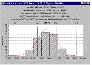
If the distribution of the quality characteristic is normal, one can make inferences concerning the proportion of items (piston rings) within specification limits (methods for non-normal distributions are also available; namely the so-called Percentile Method).
Common indices for process capability are Cp, Cr, and Cpk. All of these indices basically reflect the ratio of the engineering tolerances (process range) to the � 3 sigma limits around the nominal specifications.
For computational details, see Process Capability Indices; see also Process Performance.
Process Performance Indices. When monitoring a process via a quality control chart (e.g., the X-bar and R-chart; Quality Control) it is often useful to compute the process capability indices for the process. Specifically, when the data set consists of multiple samples, such as data collected for the quality control chart, then one can compute two different indices of variability in the data. One is the regular standard deviation for all observations, ignoring the fact that the data consist of multiple samples; the other is to estimate the process's inherent variation from the within-sample variability. For example, when plotting X-bar and R-charts one may use the common estimator R-bar/d2 for the process sigma (e.g., see Duncan, 1974; Montgomery, 1985, 1991). Note however, that this estimator is only valid if the process is statistically stable. For a detailed discussion of the difference between the total process variation and the inherent variation refer to ASQC/AIAG reference manual (ASQC/AIAG, 1991, page 80).
When the total process variability is used in the standard capability computations, the resulting indices are usually referred to as process performance indices (as they describe the actual performance of the process; common indices are Pp, Pr, and Ppk), while indices computed from the inherent variation (within-sample sigma) are referred to as capability indices (since they describe the inherent capability of the process; common indices are Cp, Cr, and Cpk).
For additional information, see also Process Capability Indices; for computational details, see Process Capability Analysis.
Pruning (in Classification Trees). Pruning a classification tree refers to the use of the automatic "right-sized" tree selection procedures developed by Breiman et. al. (1984). These procedures are designed to find, without relying on subjective judgment, the "right-sized" classification tree, that is, a classification tree with an appropriate number of splits and optimal predictive accuracy. The process of determining the "right-sized" classification tree is described in the Computational Methods section of the Classification Trees chapter.
Pseudo-components. Pseudo-components are transformed values of the components (plotted in Ternary graphs) where:
x'i = (xi-Li)/(Total-L)
Here, x'i stands for the ith pseudo-component, xi stands for the original component value, Li stands for the lower constraint (limit) for the ith component, L stands for the sum of all lower constraints (limits) for all components in the design, and Total stands for the mixture total. This transformation makes the coefficients for different factors comparable in size.
(See Cornell, 1993, Chapter 3).
Pseudo-Inverse Algorithm. An algorithm to efficiently optimize a linear model; also known as singular value decomposition (see Bishop, 1995; Press et. al., 1992; Golub and Kahan, 1965).
Pseudo-Inverse - Singular Value Decomposition (in Neural Networks). This algorithm uses the singular value decomposition technique to calculate the pseudo-inverse of the matrix needed to set the weights in a linear (dot product synaptic function + identity activation function) output layer, so as to find the least mean squared solution. Essentially, it guarantees to find the optimal setting for the weights in a linear layer, to minimize the RMS training set error (Bishop, 1995; Press et. al., 1992; Golub and Kahan, 1965). This is the standard least-squares optimization technique.
Linear techniques are extremely important in optimization, not least because it is possible to find an optimal solution to a linear model - something that is not guaranteed with nonlinear models, such as other types of neural networks, even if training algorithms converge.
The pseudo-inverse procedure, in addition to guaranteeing to find the absolute minimum error, is also relatively quick.
Pseudo-inverse is typically used in a number of circumstances:
To optimize the linear output layer in a radial basis function network, subsequent to center and deviation assignment using the unsupervised algorithms.
To optimize the output layer in a linear network.
To fine-tune the final layer in a multilayer perceptron with a linear output layer, as used in regression problems.
Technical Details. The matrix G is calculated, whose i, j'th element is the input of the i'th output unit, when the j'th case is executed.
The least-squares solution is then given by:
w = G+ d
G+ = (GTG)-IGT is the pseudo-inverse matrix.
w is the weight vector into an output unit.
d is the desired response vector (training outputs) for that output.
G+ is calculated using the singular value decomposition algorithm.
Caution. The singular value decomposition algorithm is usually numerically stable; however, occasionally a badly behaved matrix can cause it to generate mathematical errors. If this occurs, follow the steps below:
Check that the training cases and (in the case of a radial basis function network) centers and deviations have been sensibly assigned.
In particular, the algorithm performs badly if radial deviations are very high (i.e., the standard deviations of Gaussians are very small). It may be necessary to increase the number of neighbors if assigning radial deviation using K-nearest neighbors, or to increase the Deviation multiplier if using Isotropic deviation assignment.
If training cases, centers and deviations are all sensible, and the algorithm still fails, use Conjugate Gradient Descent to set the weights in the linear layer. Although typically slower than pseudo-inverse, this algorithm does not generate arithmetic errors and is guaranteed to find the minimum, as there are no local minima in this case.
See also lack of fit, design matrix; or see the General Linear Models, General Regression Models, or Experimental Design chapters.