See the Canonical Correlation chapter for more information.
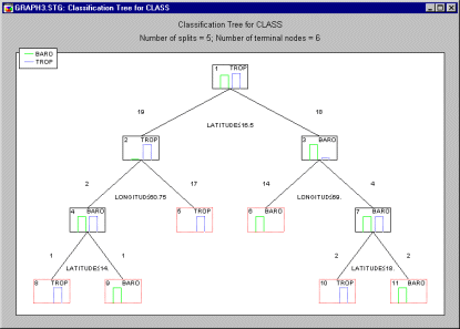
C&RT. C&RT, or Classification and Regression Trees, is a classification tree program developed by Breiman et. al. (1984).
Classification and Regression Trees are analytic procedure for predicting the values of a continuous response variable (e.g., Height) or categorical response variable (e.g., Marital Status: Single, Married, Divorced) from continuous or categorical predictors. When the dependent or response variable of interest is categorical in nature, the technique is referred to as Classification Trees; if the response variable of interest is continuous in nature, the method is referred to as Regression Trees. The classic computational algorithms for classification and regression trees (C&RT) were popularized by Breiman, Friedman, Olshen, & Stone, 1984 (see also Ripley, 1996; Hastie, Tibshirani, & Friedman, 2001). For classification problems, the goal is generally to find a tree where the terminal tree nodes are relatively "pure, " i.e., contain observations that (almost) all belong to the same category or class; for regression tree problems node purity is usually defined in terms of the sums-of-squares deviation within each node.
At each step, the program will find a logical split condition to assign observations to the two child nodes; for continuous predictors these logical conditions are usually of the type If x > Value then NodeID=k; for categorical predictors, the logical split conditions are usually of the type If x=Category I then NodeID=k.
For more details, see the STATISTICA Classification and Regression Trees (C&RT) chapter.
Cartesian Coordinates. Cartesian coordinates (x, y, or x, y, z; also known as rectangular coordinates) are directed distances from two (or three) perpendicular axes.
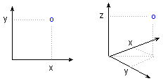
The location of a point in space is established by the corresponding coordinates on the X-and Y-axes (or X-, Y- , and Z-axes).
See also, Polar Coordinates.
Casewise MD Deletion. When casewise deletion of missing data is selected, then only cases that do not contain any missing data for any of the variables selected for the analysis will be included in the analysis. In the case of correlations, all correlations are calculated by excluding cases that have missing data for any of the selected variables (all correlations are based on the same set of data).
See also, Casewise vs. pairwise deletion of missing data
Categorical Predictor Variable. A categorical predictor variable is a variable, measured on a nominal scale, whose categories identify class or group membership, which is used to predict responses on one or more dependent variables. Gender would be an example of a categorical predictor variable, with the two classes or groups Male and Female.
See also nominal scale of measurement.
Categorized Graphs (also, Trellis Graphs). This type of graph allows you to categorize 2D, 3D, or nD plots by the specified categories of a selected variable. One component graph is produced for each level of the grouping variable (or user-defined subset of data) and all the component graphs are arranged in one display to allow for comparisons between the subsets of data (categories). For a detailed discussion of Categorized Graphs, see Categorized Graphs in Selected Topics in Graphical Analytic Techniques, see also Data Mining.
Categorized Plots, 2D - Detrended Probability Plots. This categorized plot is constructed in the same way as the standard normal probability plot for the categorized values, except that before the plot is generated, the linear trend is removed. This often "spreads out" the plot, thereby allowing the user to detect patterns of deviations more easily.
For a detailed discussion of Categorized Graphs, see Categorized Graphs in Selected Topics in Graphical Analytic Techniques.
Categorized Plots, 2D - Half-Normal Probability Plots.
The categorized half-normal probability plot is constructed in the same manner as the standard normal probability plot, except that only the positive half of the normal curve is considered. Consequently, only positive normal values will be plotted on the Y-axis. This plot is often used in plots of residuals (e.g., in multiple regression), when one wants to ignore the sign of the residuals, that is, when one is interested in the distribution of absolute residuals, regardless of the sign.
For a detailed discussion of Categorized Graphs, see Categorized Graphs in Selected Topics in Graphical Analytic Techniques.
Categorized Plots, 2D - Normal Probability Plots. This type of probability plot is constructed as follows. First, within each category, the values (observations) are rank ordered. From these ranks one can compute z values (i.e., standardized values of the normal distribution) based on the assumption that the data come from a normal distribution (see Computation Note). These z values are plotted on the Y-axis in the plot. If the observed values (plotted on the X-axis) are normally distributed, then all values should fall onto a straight line. If the values are not normally distributed, then they will deviate from the line. Outliers may also become evident in this plot. If there is a general lack of fit, and the data seem to form a clear pattern (e.g., an S shape) around the line, then the variable may have to be transformed in some way (e.g., a log transformation to "pull-in" the tail of the distribution, etc.) before some statistical techniques that are affected by non-normality can be used.
For a detailed discussion of Categorized Graphs, see Categorized Graphs in Selected Topics in Graphical Analytic Techniques.
Categorized Plots, 3D - Contour Plot. This type of graph projects a 3-dimensional surface onto a 2-dimensional plane as contour plots for each level of the grouping variable. The plots are arranged in one display to allow for comparisons between the subsets of data (categories).
For a detailed discussion of Categorized Graphs, see Categorized Graphs in Selected Topics in Graphical Analytic Techniques.
Categorized Plots, 3D - Deviation Plot. Data points (representing the X, Y and Z coordinates of each point) in this graph are represented in 3D space as "deviations" from a specified base- level of the Z-axis. One component graph is produced for each level of the grouping variable (or user-defined subset of data) and all the component graphs are arranged in one display to allow for comparisons between the subsets of data (categories).
For a detailed discussion of Categorized Graphs, see Categorized Graphs in Selected Topics in Graphical Analytic Techniques.
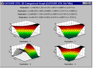
Categorized Plots, 3D - Scatterplot. This type of graphs visualizes a relationship between three variables (representing the X, Y, and one or more Z [vertical] coordinates of each point in 3- dimensional space) categorized by a grouping variable. One component graph is produced for each level of the grouping variable (or user-defined subset of data) and all the component graphs are arranged in one display to allow for comparisons between the subsets of data (categories) (see graph number 1, below).
For a detailed discussion of Categorized Graphs, see Categorized Graphs in Selected Topics in Graphical Analytic Techniques. See also, Data Reduction.
Categorized Plots, 3D - Space Plot. This type of graph offers a distinctive means of representing 3D scatterplot data through the use of a separate X-Y plane positioned at a user-selectable level of the vertical Z-axis (which "sticks up" through the middle of the plane). The level of the X-Y plane can be adjusted in order to divide the X-Y-Z- space into meaningful parts (e.g., featuring different patterns of the relation between the three variables) (see graph number 2, above).
For a detailed discussion of Categorized Graphs, see Categorized Graphs in Selected Topics in Graphical Analytic Techniques.
Categorized Plots, 3D - Spectral Plot. This type of graph produces multiple spectral plots (for subsets of data determined by the selected categorization method) arranged in one display to allow for comparisons between the subsets of data. Values of variables X and Z are interpreted as the X- and Z-axis coordinates of each point, respectively; values of variable Y are clustered into equally-spaced values, corresponding to the locations of the consecutive spectral planes (see graph number 3, above).
For a detailed discussion of Categorized Graphs, see Categorized Graphs in Selected Topics in Graphical Analytic Techniques.
Categorized Plots, 3D - Surface Plot. In this type of graph , a surface (defined by a smoothing technique or user-defined mathematical expression) is fitted to the categorized data (variables corresponding to sets of XYZ coordinates, for subsets of data determined by the selected categorization method) arranged in one display to allow for comparisons between the subsets of data (categories).
For a detailed discussion of Categorized Graphs, see Categorized Graphs in Selected Topics in Graphical Analytic Techniques.
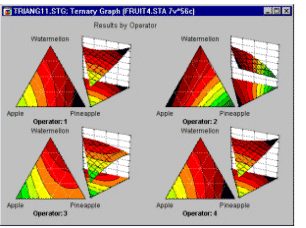
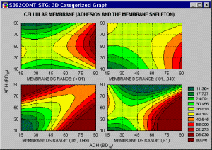
Categorized Contour/Areas (Ternary graph). This 3D Categorized Plot projects a 3-dimensional surface onto a 2-dimensional plane as area contour plots for each level of the grouping variable. One component graph is produced for each level of the grouping variable (or user-defined subset of data) and all the component graphs are arranged in one display to allow for comparisons between the subsets of data (categories).
For a detailed discussion of Categorized Graphs, see Categorized Graphs in Selected Topics in Graphical Analytic Techniques.
Categorized Contour/Lines (Ternary graph). This 3D Categorized Plot projects a 3-dimensional surface onto a 2-dimensional plane as line contour plots for each level of the grouping variable. One component graph is produced for each level of the grouping variable (or user-defined subset of data) and all the component graphs are arranged in one display to allow for comparisons between the subsets of data (categories).
For a detailed discussion of Categorized Graphs, see Categorized Graphs in Selected Topics in Graphical Analytic Techniques.
Categorizing, Grouping, Slicing, Drilling-down. One of the most important, general, and also powerful analytic methods involves dividing ("splitting") the data set into categories in order compare the patterns of data between the resulting subsets. This common technique is known under a variety of terms (such as breaking down, grouping, categorizing, splitting, slicing, drilling-down, or conditioning) and it is used both in exploratory data analyses and hypothesis testing. For example: A positive relation between the age and the risk of a heart attack may be different in males and females (it may be stronger in males). A promising relation between taking a drug and a decrease of the cholesterol level may be present only in women with a low blood pressure and only in their thirties and forties. The process capability indices or capability histograms can be different for periods of time supervised by different operators. The regression slopes can be different in different experimental groups.
There are many computational techniques that capitalize on grouping and that are designed to quantify the differences that the grouping will reveal (e.g., ANOVA/MANOVA). However, graphical techniques (such as categorized graphs) offer unique advantages that cannot be substituted by any computational method alone: they can reveal patterns that cannot be easily quantified (e.g., complex interactions, exceptions, anomalies) and they provide unique, multidimensional, global analytic perspectives to explore or mine the data.
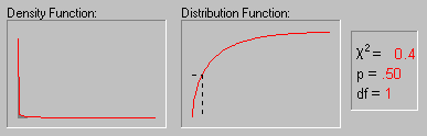
Cauchy Distribution. The Cauchy distribution (the term first used by Upensky, 1937) has density function:
f(x) = 1/(
 *{1 + [(x-
 )/]2})
0 <
where
is the location parameter (median)
is the scale parameter
is the constant Pi (3.14...)
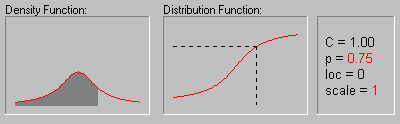
The animation above shows the changing shape of the Cauchy distribution when the location parameter equals 0 and the scale parameter equals 1, 2, 3, and 4.
Cause-and-Effect Diagram. The Cause-and-Effect diagram provides an efficient summary of factors that impact a process, and hence can be used as a map to guide the overall quality improvement efforts. Therefore, it is one of the important tools for the Define phase of Six Sigma quality control efforts. The diagram is also sometimes referred to as a "fishbone chart," because of it's appearance, or an Ishikawa chart. The latter name refers to the work of Professor Kaoru Ishikawa of Tokyo University who developed this diagram to depict variables which are present in a process. The general idea of the chart is rather straightforward. Suppose you want to turn on a reading light in your house one evening, and it won't light up. Now consider the various variables or characteristics that make up the process (cause the light to come on), and which should be considered in order to fix this quality problem:
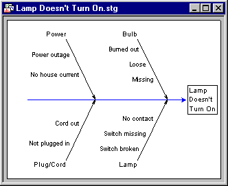
The cause-and-effect diagram shown above (adapted from Rath & Strong's Six Sigma pocket guide, 2000) spells out the various potential causes of the problem encountered. Usually, the chart is constructed by identifying (1) the major categories of causes that affect the process (in this example Power, Bulb, Plug/Cord and Lamp), and (2) the individual factors or causes that can be classified into these major categories (e.g., Power outage, No house current, etc.). You could now use this map as a guide to troubleshooting the problem you encountered turning on your reading light. You can also further "augment" this chart by adding various sub-sub causes, causes that you ruled out, solutions you have tried, etc.
The cause-and-effect diagram plays a central role in Six Sigma quality programs. During the first stage of the Define-Measure-Analyze-Improve-Control (DMAIC) cycle, this diagram can be of great utility in order to identify the areas, departments, processes, and stakeholders that should be involved in the effort. See Harry and Schroeder (2000), Pyzdek (2001), or Rath and Strong (2000) for additional details; see also the Six Sigma topic.
Censoring (Censored Observations). Observations are referred to as censored when the dependent variable of interest represents the time to a terminal event, and the duration of the study is limited in time. Although the concept was developed in the biomedical research, censored observations may occur in a number of different areas of research. For example, in the social sciences we may study the "survival" of marriages, high school drop-out rates (time to drop-out), turnover in organizations, etc. In each case, by the end of the study period, some subjects probably will still be married, will not have dropped out, or will still be working at the same company; thus, those subjects represent censored observations.
In economics we may study the "survival" of new businesses or the "survival" times of products such as automobiles. In quality control research, it is common practice to study the "survival" of parts under stress (failure time analysis).
Data sets with censored observations can be analyzed via Survival Analysis or via Weibull and Reliability/Failure Time Analysis.
See also, Type I and II Censoring, Single and Multiple Censoring and Left and Right Censoring.
CHAID. CHAID is a classification trees program developed by Kass (1980) that performs multi-level splits when computing classification trees. For discussion of the differences of CHAID from other classification tree programs, see A Brief Comparison of Classification Tree Programs.
Characteristic Life.
In Weibull and Reliability/Failure Time Analysis the characteristic life is defined as the point in time where 63.2 percent of the population will have failed; this point is also equal to the respective scale parameter b of the two-parameter Weibull distribution (with  = 0; otherwise it is equal to b+).
Chi-square Distribution. The Chi-square distribution is defined by:
f(x) = {1/[2 /2 *
/2 *  (/2)]} * [x(/2)-1 * e-x/2]
= 1, 2, ..., 0 < x
where
is the degrees of freedom
e is the
base of the natural logarithm, sometimes called Euler's e (2.71...)
(gamma) is the Gamma function
The above animation shows the shape of the Chi-square distribution as the degrees of freedom increase (1, 2, 5, 10, 25 and 50).
| 1.00 0.80 0.60 0.40 0.20 0.40 0.60 0.80 |
1.00 0.80 0.60 0.40 0.20 0.40 0.60 |
1.00 0.80 0.60 0.40 0.20 0.40 |
1.00 0.80 0.60 0.40 0.20 |
1.00 0.80 0.60 0.40 |
1.00 0.80 0.60 |
1.00 0.80 |
1.00 |
Circumplex is a special case of a more general concept of radex, developed by Louis Guttman (who contributed a number of innovative ideas to the theory of multidimensional scaling and factor analysis, Guttman, 1954).
City-Block Error Function (in Neural Networks). Defines the error between two vectors as the sum of the differences in each component. Less sensitive to outliers than sum-squared, but usually causes poorer training performance (see Bishop, 1995).
See also the chapter on neural networks.
City-block (Manhattan) distance. A distance measure computed as the average difference across dimensions. In most cases, this distance measure yields results similar to the simple Euclidean distance. However, note that in this measure, the effect of single large differences (outliers) is dampened (since they are not squared). See, Cluster Analysis.
Classification. Assigning data (i.e., cases or observations) cases to one of a fixed number of possible classes (represented by a nominal output variable).
Classification (in Neural Networks).
In classification, the aim is to assign input cases to one of a number of classes.
Classification problems fall into two categories: two-class problems, and many-class problems. A two-class problem is usually encoded using a single output neuron. Many-class problems use one output neuron per class. It is also possible to encode two-class problems using this approach (i.e., using two output neurons), and this is in fact the approach taken by PNN networks.
Single output neuron. In these two-class networks, the target output is either 1.0 (indicating membership of one class) or 0.0 (representing membership of the other).
Multiple output neurons. In many-class problems, the target output is 1.0 in the correct class output and 0.0 in the others.
The output neuron activation levels provide confidence estimates for the output classes. It is desirable to be able to interpret these confidence levels as probabilities. If the correct choice of network error function is used during optimization, combined with the correct activation function, such as interpretation can be made. Specifically, a cross entropy error function is combined with the logistic activation function for a two-class problem encoded by a single output neuron or with softmax for a three or more class problem.
The entropic approach corresponds to maximum likelihood optimization, assuming that the data is drawn from the exponential family of distributions. An important feature is that the outputs may be interpreted as posterior estimates of class membership probability.
The alternative approach is to use a sum-squared error function with the logistic output activation function. This has less statistical justification - the network learns a discriminant function, and although the outputs can be treated as confidence measures, they are not probability estimates (and indeed may not even sum to 1.0). On the other hand, such networks sometimes train more quickly, the training process is more stable, and they may achieve higher classification rates.
Classification by Labeled Exemplars (in Neural Networks).Classification neural networks must translate the numeric level on the output neuron(s) to a nominal output variable. There are two very different approaches to assigning classifications.
In one of these, the activation level of the output layer units determines the class, usually by interpreting the activation level as a confidence measure, and finding the highest confidence class. That approach is used in most neural network types.
This topic discusses the alternative approach, which is used in SOFM and Cluster networks.
These types of networks store labeled exemplar vectors in their radial layer. When a new case is presented to the network, the network in essence calculates the distance between the (possibly normalized) new case and each exemplar vector; the activations of the neurons encode these distances. Each of these neurons has a class label. The class label of the "winning" (smallest distance from input case) neuron is typically used as the output of the network. The standard algorithm is extended slightly using the KL nearest neighbor algorithm; the class assigned by the network is the most common class among the K winning neurons, provided that at least L of them agree (otherwise, the class is "Unknown").
The input case might actually be very distant from any of the exemplar vectors, in which case it may be better to assign the case as "Unknown." You can optionally specify an accept threshold for this eventuality. If the normalized distance is greater than this threshold, the class is "Unknown."
Classification Statistics (in Neural Networks).One of the major uses of neural networks is to perform classification tasks, i.e., to assign cases to one of a number of possible classes. The class of a case is indicated by the use of a nominal output variable.
The classification statistics include, for each class:
Total. Number of cases of that class.
Correct. Number of cases correctly classified.
Wrong. Number of cases erroneously assigned to another class.
Unknown. Number of cases that could not be positively classified.
Correct (%). Percentage of cases correctly classified.
Wrong (%). Percentage of cases wrongly classified.
Unknown (%). Percentage of cases classified as unknown.
Classification Thresholds (in Neural Networks).Classification neural networks must translate the numeric activation level of the output neuron(s) to a nominal output variable. There are two very different approaches to assigning classifications.
One of these, where the neural network determines the "winning" neuron or neurons in the radial layer of the network, and then uses the class labels on those neurons, is described in Classification by Labeled Exemplars. This approach is used in SOFM and Cluster networks.
Here we discuss the alternative approach, where it is the activation level of the output layer units, which are not radial units, that determines the class. This approach is used in all other network types.
Two cases need to be distinguished: single output neuron versus multiple output neurons.
Single output neurons are typically used for two-class problems, with a high output neuron level indicating one class and a low activation the other class. This configuration uses the Two-state conversion function.
Multiple output neurons are typically used for three or more class problems. One neuron is used for each class, and the highest activation neuron indicates the class. The neuron activation levels can be interpreted as confidence levels. This method is implemented by using the One-of-N conversion function for the output variable. You can optionally configure a multilayer perceptron to use two output neurons for a two-class output variable.
Single output neuron. Two thresholds are used: accept and reject. In the single output neuron case, the output is considered to be the first class if the output neuron's activation is below the reject threshold, and to be the second class if its activation is above the accept threshold. If the activation is between the two thresholds, the class is regarded as "unknown" (the so-called doubt option). If the two thresholds are equal, there is no doubt option. There are two common configurations: accept=reject=0.5 implies no doubt option, with the most likely class assigned; accept=0.95, reject=0.05 implies standard "95% confidence" in assignment of a class, with doubt expressed otherwise. Both of these cases assume the standard logistic output neuron activation function, which gives the output neuron a (0,1) range; the thresholds should be adjusted accordingly for different activation functions [e.g., hyperbolic tangent uses output range (-1,+1)].
As an alternative to selecting the thresholds yourself, you can specify a loss coefficient that gives the relative "cost" of the two possible misclassifications (false-positive versus false-negative). A loss coefficient of 1.0 indicates that the two classes are equally important. A loss coefficient above 1.0 indicates that it is relatively more important to correctly recognize class two cases, even at the expense of misclassifying more class one cases. The thresholds (which are equal) are determined by calculating a ROC curve and determining the point on the curve where the ratio of false positives to false negatives equals the loss coefficient. This equalizes the weighted loss on each class, independent of the number of cases in each (i.e. with a loss coefficient of 1.0, it is the proportion of misclassifications in each class that is equalized, not the number of absolute number of misclassifications).
Multiple output neurons. If no thresholds are used, the network uses a "winner takes all" algorithm; the highest activation neuron gives the class. There is a "no doubt" option.
If you specify thresholds, the class is still assigned to the highest neuron, but there is a doubt option. The highest neuron's activation must be above the accept threshold and all other neuron's below the reject threshold in order for the class to be assigned; if this condition is not fulfilled, the class is "unknown."
If your multiple output neuron classification network is using the softmax activation function, the output neuron activations are guaranteed to sum to 1.0 and can be interpreted as probabilities of class membership. However, in other cases, although the activations can be interpreted as confidence levels in some sense (i.e. a higher number indicates greater confidence), they are not probabilities, and should be interpreted with caution.
Ordinal classification. If you have a large number of classes, one-of-N encoding can become extremely unwieldy, as the number of neurons in the network proliferates. An alternative approach then is to use ordinal encoding. The output is mapped to a single neuron, with the output class represented by the ordinals 1, 2, 3, etc. The problem with this technique is that it falsely implies an ordering on the classes (i.e. class 1 is more like class 2 than class 3).
However, in some circumstances it may be the only viable approach.
You can specify ordinal encoding by changing the conversion function of the output variable to minimax. The ordinals are then mapped into the output range of the neuron.
With ordinal encoding, the output is determined as follows. The output neuron's activation is linearly scaled using the factors determined by minimax, then rounded to the nearest integer. This ordinal value gives the class.
The only classification threshold used in the accept threshold. If the difference between the output and the selected ordinal is greater than the threshold, then the classification is instead "unknown."
Example. The output is 3.8, which is rounded to the nearest ordinal 4. The difference is 0.2. If an accept threshold less than 0.2 has been selected, the classification is rejected, and "unknown" is generated.
An accept threshold of 0.5 or above is equivalent to not using a threshold at all.
Classification Trees. Classification trees are used to predict membership of cases or objects in the classes of a categorical dependent variable from their measurements on one or more predictor variables. For a detailed description of classification trees, see the Classification Trees chapter.Class Labeling (in Neural Networks).
A variety of clustering algorithms and networks are supported. All of these have networks where the second layer consists of Radial units, and these units contain exemplar vectors. In SOFM and Cluster networks, these are combined in a two layer neural network with a single nominal output variable and the KNearest output conversion function to produce a classification based upon the nearest exemplar vector(s) to an input case.
The exemplar vectors can be positioned using a variety of cluster-center and sampling approaches. However, it is also necessary to apply class labels to the radial units (i.e. label each radial unit as representative of a particular class). Class labels can be applied using the class labeling algorithms described here.
KL Nearest Neighbor Labeling. This algorithm assigns labels to units based upon the labels of the K nearest neighboring training cases. Provided that at least L of the K neighbors are of the same class, this class is used to label the unit. If not, a blank label is applied, signifying an "unknown" class.
Note that this is distinct from (although related to) the KL-Nearest algorithm used when executing cluster networks, which reports the class of at least L of the K nearest units to the input case.
Voronoi Labeling. This algorithm assigns labels to units based upon the labels of the training cases that are "assigned" to that unit. Assigned cases are those that are nearer to this unit than to any other (i.e. those that would be classified by this unit if using the 1-NN classification scheme). These are the cases in the Voronoi neighborhood of the unit. The class of the majority of the training cases is used to label the unit, provided that at least a given minimum proportion of the training cases belong to this majority. If not, a blank label is applied, signifying an "unknown" class.
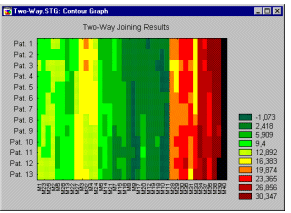
Cluster Analysis. The term cluster analysis (first used by Tryon, 1939) actually encompasses a number of different classification algorithms which can be used to develop taxonomies (typically as part of exploratory data analysis). For example, biologists have to organize the different species of animals before a meaningful description of the differences between animals is possible. According to the modern system employed in biology, man belongs to the primates, the mammals, the amniotes, the vertebrates, and the animals. Note how in this classification, the higher the level of aggregation the less similar are the members in the respective class. Man has more in common with all other primates (e.g., apes) than it does with the more "distant" members of the mammals (e.g., dogs), etc. For information on specific types of cluster analysis methods, see Joining (Tree Clustering), Two-way Joining (Block Clustering), and K-means Clustering.See the Cluster Analysis chapter for more general information; see also the Classification Trees chapter.
Cluster Diagram (in Neural Networks). A scatter diagram plotting cases belonging to various classes in two dimensions. The dimensions are provided by the output levels of units in the neural network. See also, Cluster Analysis.
Cluster Networks (in Neural Networks).
Cluster networks are actually a non-neural model presented in a neural form for convenience. A cluster network consists of a number of class-labeled exemplar vectors (each represented by a radial neuron). The vectors are assigned centers by clustering algorithms such as K-Means, and then labeled using nearby cases. After labeling, the centers positions can be fine-tuned using Learned Vector Quantization.
Cluster networks are closely related to Kohonen networks, with a few differences. Cluster networks are intended for supervised learning situations where class labels are available in the training data and cluster networks do not have a topologically organized output layer.
Training consists of center assignment, followed by labeling. This can optionally be followed by LVQ training to improve center location. After training, the network can be pruned, and classification factors set, including an acceptance threshold and K,L factors for KL nearest neighbor classification.
Codes. Codes are values of a grouping variable (e.g., 1, 2, 3, ... or MALE, FEMALE) which identify the levels of the grouping variable in an analysis. Codes can either be text values or integer values.Coefficient of Determination. This is the square of the product-moment correlation between two variables (r�). It expresses the amount of common variation between the two variables.
See also, Hays, 1988.
Columns (Box Plot). In this type of box plot, vertical columns are used to represents the variable's midpoint (i.e., mean or median). The whiskers superimposed on each column mark the selected range (i.e., standard error, standard deviation, min-max, or constant) around the midpoint.
Communality. In Principal Components and Factor Analysis, communality is the proportion of variance that each item has in common with other items. The proportion of variance that is unique to each item is then the respective item's total variance minus the communality. A common starting point is to use the squared multiple correlation of an item with all other items as an estimate of the communality (refer to Multiple Regression for details about multiple regression). Some authors have suggested various iterative "post- solution improvements" to the initial multiple regression communality estimate; for example, the so-called MINRES method (minimum residual factor method; Harman & Jones, 1966) will try various modifications to the factor loadings with the goal to minimize the residual (unexplained) sums of squares.
Complex Numbers. Complex numbers are the superset that includes all real and imaginary numbers. A complex number is usually represented by the expression a + ib where a and b are real numbers and i is the imaginary part of the expression where i has the property that i**2=-1.
See also, Cross-spectrum Analysis in Time Series.
Confidence Interval. The confidence intervals for specific statistics (e.g., means, or regression lines) give us a range of values around the statistic where the "true" (population) statistic can be expected to be located (with a given level of certainty, see also Elementary Concepts).
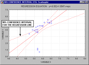
For example, the animation above shows a 90%, 95% and 99% confidence interval for the regression line.
Confidence Interval for the Mean. The confidence intervals for the mean give us a range of values around the mean where we expect the "true" (population) mean is located (with a given level of certainty, see also Elementary Concepts). In some statistics or math software packages (e.g., in STATISTICA) you can request confidence intervals for any p-level; for example, if the mean in your sample is 23, and the lower and upper limits of the p=.05 confidence interval are 19 and 27 respectively, then you can conclude that there is a 95% probability that the population mean is greater than 19 and lower than 27. If you set the p-level to a smaller value, then the interval would become wider thereby increasing the "certainty" of the estimate, and vice versa; as we all know from the weather forecast, the more "vague" the prediction (i.e., wider the confidence interval), the more likely it will materialize. Note that the width of the confidence interval depends on the sample size and on the variation of data values. The calculation of confidence intervals is based on the assumption that the variable is normally distributed in the population. This estimate may not be valid if this assumption is not met, unless the sample size is large, say n = 100 or more.
Confidence Interval vs. Prediction Interval. In regression, it is possible to predict the value of the dependent variable based on given values of the independent variables. When these values are predicted, it is also possible to calculate confidence intervals and/or prediction intervals for the dependent variable.
The confidence interval gives information on the expected value (mean) of the dependent variable. That is, a confidence interval for a predicted value of the dependent variable gives a range of values around which the "true" (population) mean (of the dependent variable for given levels of the independent variables) can be expected to be located (with a given level of certainty, see also Elementary Concepts).
The prediction interval gives information on individual predictions of the dependent variable. That is, a prediction interval for a predicted value of the dependent variable gives us a range of values around which an additional observation of the dependent variable can be expected to be located (with a given level of certainty, see also Elementary Concepts).
Note that the confidence interval will produce a smaller range of values, because it is an interval estimate for an average rather than an interval estimate for a single observation. See Neter, Wasserman, & Kutner, 1985.
Confidence limits. The same as Confidence Intervals. In Neural Networks, they represent the accept and reject thresholds, used in classification tasks, to determine whether a pattern of outputs corresponds to a particular class or not. These are applied according to the conversion function of the output variable (One-of-N, Two-state, Kohonen, etc).
Confidence Value (Association Rules). When applying (in data or text mining) algorithms for deriving association rules of the general form If Body then Head (e.g., If (Car=Porsche and Age<20) then (Risk=High and Insurance=High)), the Confidence value denotes the conditional probability of the Head of the association rule, given the Body of the association rule.
Confusion Matrix (in Neural Networks). A name sometimes given to a matrix, in a classification problem, displaying the numbers of cases actually belonging to each class, and assigned by the neural network to that or other classes. Displayed as classification statistics in STATISTICA Neural Networks.
Conjugate Gradient Descent (in Neural Networks). Conjugate gradient descent (Bishop, 1995; Shepherd, 1997) is an advanced method of training multilayer perceptrons. It usually performs significantly better than back propagation, and can be used wherever back propagation can be. It is the recommended technique for any network with a large number of weights (more than a few hundred) and/or multiple output units. For smaller networks, either Quasi-Newton or Levenberg-Marquardt may be better, the latter being preferred for low-residual regression problems.
Conjugate gradient descent is a batch update algorithm: whereas back propagation adjusts the network weights after each case, conjugate gradient descent works out the average gradient of the error surface across all cases before updating the weights once at the end of the epoch.
For this reason, there is no shuffle option available with conjugate gradient descent, since it would clearly serve no useful function. There is also no need to select learning or momentum rates for conjugate gradient descent, so it can be much easier to use than back propagation. Additive noise would destroy the assumptions made by conjugate gradient descent about the shape of search space, and so is also not available.
Conjugate gradient descent works by constructing a series of line searches across the error surface. It first works out the direction of steepest descent, just as back propagation would do. However, instead of taking a step proportional to a learning rate, conjugate gradient descent projects a straight line in that direction and then locates a minimum along this line, a process that is quite fast as it only involves searching in one dimension. Subsequently, further line searches are conducted (one per epoch). The directions of the line searches (the conjugate directions) are chosen to try to ensure that the directions that have already been minimized stay minimized (contrary to intuition, this does not mean following the line of steepest descent each time).
The conjugate directions are actually calculated on the assumption that the error surface is quadratic, which is not generally the case. However, it is a fair working assumption, and if the algorithm discovers that the current line search direction isn't actually downhill, it simply calculates the line of steepest descent and restarts the search in that direction. Once a point close to a minimum is found, the quadratic assumption holds true and the minimum can be located very quickly.
Note: The line searches on each epoch of conjugate gradient descent actually involve one gradient calculation plus a variable number (perhaps as high as twenty) of error evaluations. Thus a conjugate gradient descent epoch is substantially more time-consuming (typically 3-10 times longer) than a back propagation epoch. If you want to compare performance of the two algorithms, you will need to record the time taken.
Technical Details. Conjugate gradient descent is batch-based; it calculates the error gradient as the sum of the error gradients on each training case.
The initial search direction is given by:
![]()
Subsequently, the search direction is updated using the Polak-Rebiere formula:

If the search direction is not downhill, the algorithm restarts using the line of steepest descent. It restarts anyway after W directions (where W is the number of weights), as at that point the conjugacy has been exhausted.
Line searches are conducted using Brent's iterative line search procedure, which utilizes a parabolic interpolation to locate the line minima extremely quickly.
Contour/Discrete Raw Data Plot. This sequential plot can be considered to be a 2D projection of the 3D Ribbons plot. Each data point in this plot is represented as a rectangular region, with different colors and/or patterns corresponding to the values (or range of values of the data points (the ranges are described in the legend). Values within each series are presented along the X-axis, with each series plotted along the Y-axis.
Contour Plot. A contour plot is the projection of a 3-dimensional surface onto a 2-dimensional plane.
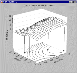
As compared to surface plots, they may be less effective to quickly visualize the overall shape of 3D data structures,
however, their main advantage is that they allow for precise examination and analysis of the shape of the surface (Contour Plots display a series of undistorted horizontal "cross sections" of the surface).
Cook's distance. This is another measure of impact of the respective case on the regression equation. It indicates the difference between the computed B values and the values one would have obtained, had the respective case been excluded. All distances should be of about equal magnitude; if not, then there is reason to believe that the respective case(s) biased the estimation of the regression coefficients.
See also, standard residual value, Mahalanobis distance, and deleted residual.
Correlation. Correlation is a measure of the relation between two or more variables. Correlation coefficients can range from -1.00 to +1.00. The value of -1.00 represents a perfect negative correlation while a value of +1.00 represents a perfect positive correlation. A value of 0.00 represents a lack of correlation.
See also, Correlation, Partial Correlation, Pearson Correlation and Spurious Correlations.
Correlation Value (Association Rules). When applying (in data or text mining) algorithms for deriving association rules of the general form If Body then Head (e.g., If (Car=Porsche and Age<20) then (Risk=High and Insurance=High)), a Correlation value can be computed as the support value for the rule, divided by the square root of the product of the support values for the Body and Head computed separately.
Correspondence Analysis. Correspondence analysis is a descriptive/exploratory technique designed to analyze simple two-way and multi-way tables containing some measure of correspondence between the rows and columns. The results provide information which is similar in nature to those produced by Factor Analysis techniques, and they allow one to explore the structure of categorical variables included in the table. The most common kind of table of this type is the two-way frequency crosstabulation table (see, for example, the Basic Statistics or Log-Linear chapter).
See the Correspondence Analysis chapter for more information.
Potential capability (Cp). This is the simplest and most straightforward indicator of process capability. It is defined as the ratio of the specification range to the process range; using � 3 sigma limits we can express this index as:
Cp = (USL-LSL)/(6*Sigma)
Put into words, this ratio expresses the proportion of the range of the normal curve that falls within the engineering specification limits (provided that the mean is on target, that is, that the process is centered).
Non-centering correction (K). We can correct Cp for the effects of non-centering. Specifically, we can compute:
K = abs(Target Specification - Mean)/(1/2(USL-LSL))
This correction factor expresses the non-centering (target specification minus mean) relative to the specification range. Demonstrated excellence (Cpk). Finally, we can adjust Cp for the effect of non-centering by computing:
Cpk = (1-k)*Cp
If the process is perfectly centered, then k is equal to zero, and Cpk is equal to Cp. However, as the process drifts from the target specification, k increases and Cpk becomes smaller than Cp.
Capability ratio (Cr). This index is equivalent to Cp; specifically, it is computed as 1/Cp (the inverse of Cp).
Estimate of sigma. When the data set consists of multiple samples, such as data collected for the quality control chart, then one can compute two different indices of variability in the data. One is the regular standard deviation for all observations, ignoring the fact that the data consist of multiple samples; the other is to estimate the process's inherent variation from the within-sample variability. When the total process variability is used in the standard capability computations, the resulting indices are usually referred to as process performance indices (as they describe the actual performance of the process; common indices are Pp, Pr, and Ppk), while indices computed from the inherent variation (within-sample sigma) are referred to as capability indices (since they describe the inherent capability of the process; common indices are Cp, Cr, and Cpk).
See Process Capability Indices and Process Capability Analysis.
Cross Entropy (in Neural Networks). Error functions based on information-theoretic measures, and particularly appropriate for classification networks. There are two versions, for single-output networks and multiple-output networks; these should be combined with the logistic and softmax activation functions respectively (Bishop, 1995).
See also the chapter on neural networks.
Cross Verification (in Neural Networks). The same as Cross-Validation. In the context of neural networds, the use of an auxiliary set of data (the verification set) during iterative training. While the training set is used to adjust the network weights, the verification set maintains an independent check that the neural network is learning to generalize.
Cross-Validation. Cross-validation refers to the process of assessing the predictive accuracy of a model in a test sample (sometimes also called a cross-validation sample) relative to its predictive accuracy in the learning sample from which the model was developed. Ideally, with a large sample size, a proportion of the cases (perhaps one-half or two-thirds) can be designated as belonging to the learning sample and the remaining cases can be designated as belonging to the test sample. The model can be developed using the cases in the learning sample, and its predictive accuracy can be assessed using the cases in the test sample. If the model performs as well in the test sample as in the learning sample, it is said to cross-validate well, or simply to cross-validate. For discussions of this type of test sample cross-validation, see the Computational Methods section of the Classification Trees chapter, the Classification section of the Discriminant Analysis chapter, and Data Mining.
A variety of techniques have been developed for performing cross-validation with small sample sizes by constructing test samples and learning samples which are partly but not wholly independent. For a discussion of some of these techniques, see the Computational Methods section of the Classification Trees chapter.
Crossed Factors. Some experimental designs are completely crossed (factorial designs), that is, each level of each factor appears with each level of all others. For example, in a 2 (types of drug) x 2 (types of virus) design, each type of drug would be used with each type of virus.
See also, ANOVA/MANOVA.
Crosstabulations (Tables, Multi-way Tables). A crosstabulation table is a combination of two (or more) frequency tables arranged such that each cell in the resulting table represents a unique combination of specific values of crosstabulated variables. Thus, crosstabulation allows us to examine frequencies of observations that belong to specific combinations of categories on more than one variable. For example, the following simple ("two-way") table shows how many adults vs. children selected "cookie A" vs. "cookie B" in a taste preference test:
| COOKIE: A | COOKIE: B | ||
|---|---|---|---|
| AGE: ADULT | 50 | 0 | 50 |
| AGE: CHILD | 0 | 50 | 50 |
| 50 | 50 | 100 |
For more information, see the section on Crosstabulations in the Basic Statistics chapter.
The term curse of dimensionality (Bellman, 1961, Bishop, 1995) generally refers to the difficulties involved in fitting models, estimating parameters, or optimizing a function in many dimensions, usually in the context of neural networks. As the dimensionality of the input data space (i.e., the number of predictors) increases, it becomes exponentially more difficult to find global optima for the parameter space, i.e., to fit models. In practice, the complexity of neural networks becomes unmanageable when the number of inputs into the neural network exceeds a few hundreds or even less, depending on the complexity of the respective neural network architecture. Hence, it is simply a practical necessity to pre-screen and preselect from among a large set of input (predictor) variables those that are of likely utility for predicting the outputs (dependent variables) of interest.
The STATISTICA Feature Selection and Variable Screening module in STATISTICA Data Miner is a unique tool for selecting continuous and/or categorical predictors for regression or classification tasks, using methods that do not bias the selection in favor of any particular model or technique for predictive data mining that might be applied to the selection.